The Timeline widget shows a time series of how media and public interest in a topic has changed over time. The media interest is the number of articles published and public interest is the number of social media interactions with those articles. The data can be grouped by hour or by day.
This powerful widget can be used to understand how interest in a crisis, event, or topic is developing and changing over time.
There are a number of additional features of the timeline widget explained below:
Timeline notes
NewsWhip Spike allows you to attach context to the graphs by adding your own notes to the timeline you’ve created. You can use these to highlight points of interest in the Timeline or to keep track of important events.
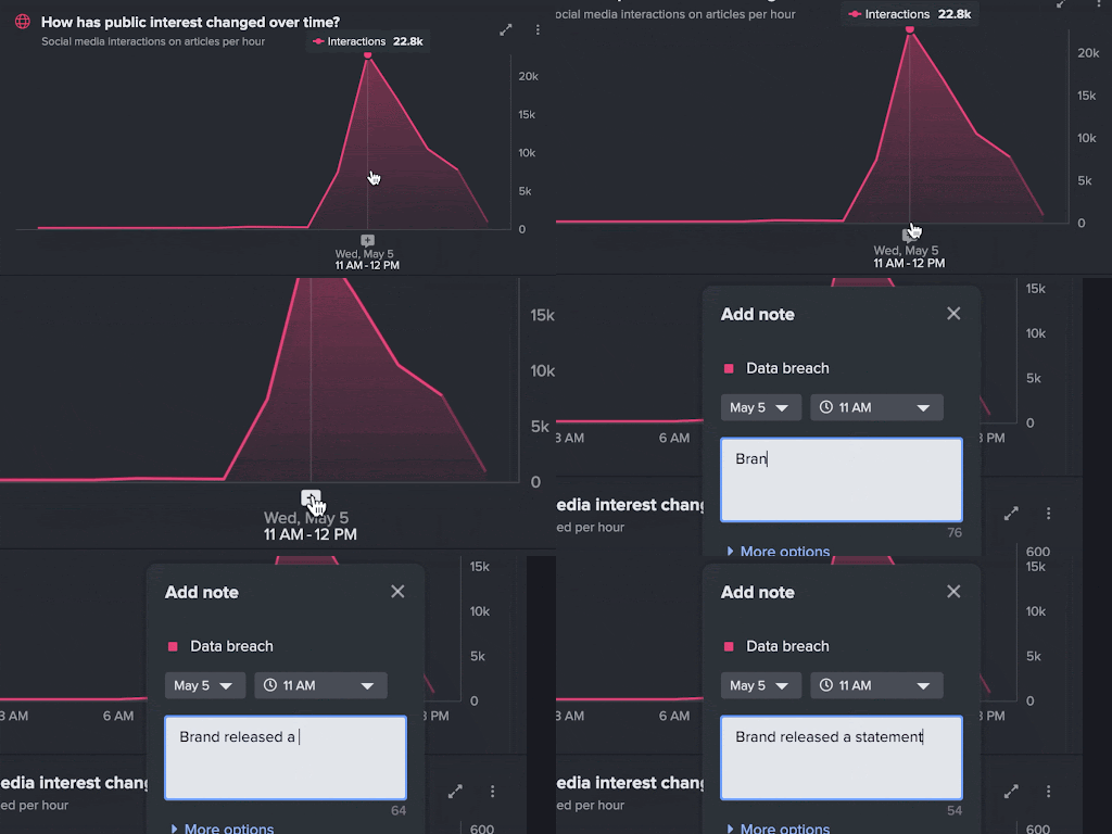
To add a note, hover on the chart and select the plus icon on the X-axis.
- You can add one note per point with an unlimited number per search.
- Choose whether the note should show on one chart or both.
Notes appear as markers on the Timeline. You can hover on a note to view the details.
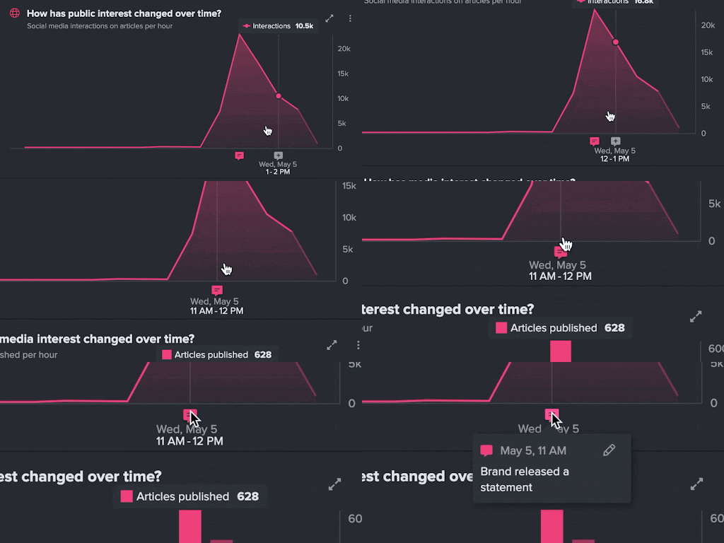
When you add a Note, it’s linked to the Saved Search that powers the dashboard.
If you add that search to another Dashboard, the notes will be visible.
Combined Timelines
You can compare searches using the Combined Timeline. To do so, simply add a second search to your dashboard and navigate to the “All Searches” view.
You can compare searches across the same, or a different, time range. This is ideal for comparing a developing crisis with a previous incident.
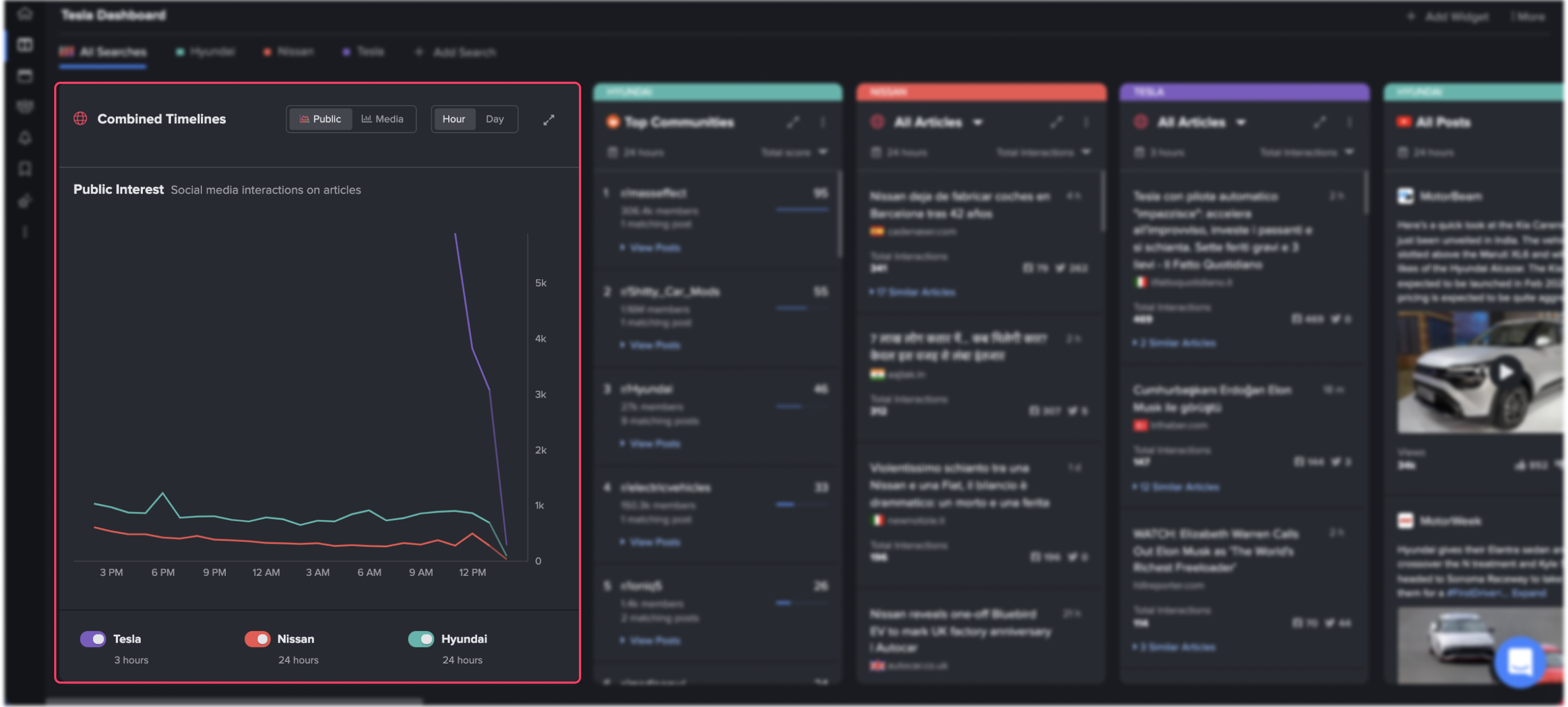
This can be displayed either to compare public interest or media interest, by toggling between the two using this button.
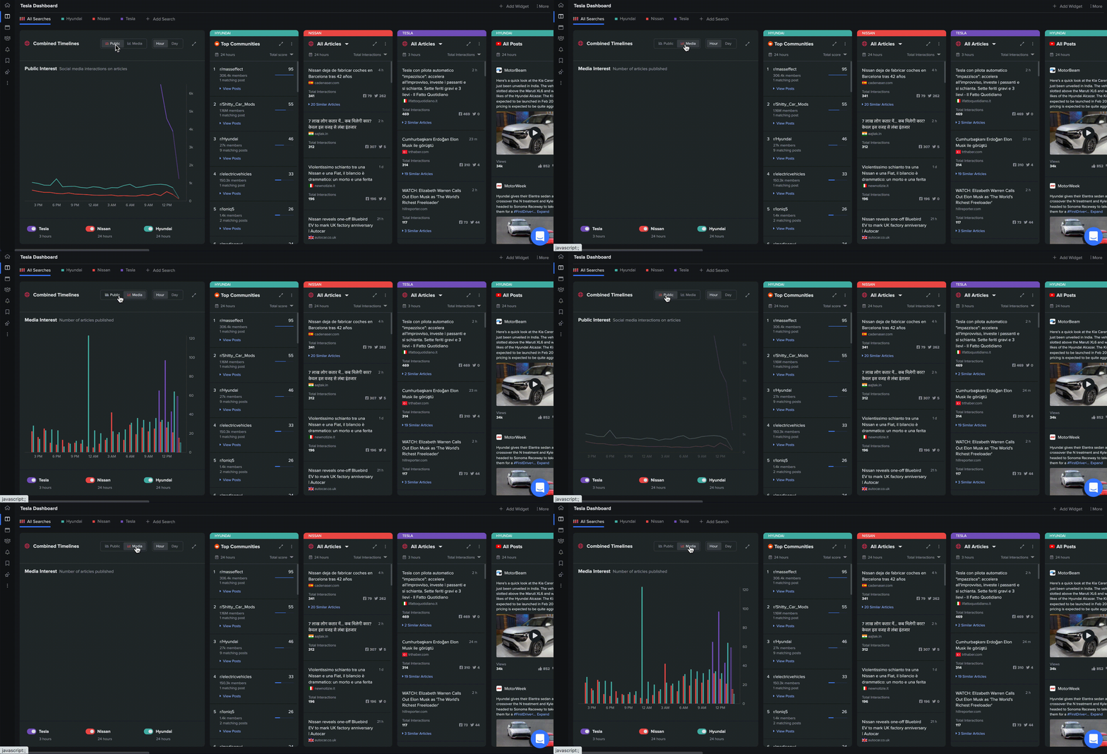
You can also expand the widget, which will show you a larger version of the graph, as well as the most engaged articles for each of the searches in the time period selected.

This is a useful way to explore and compare events in detail, or to benchmark multiple different searches against one another.
Highlights
When there are significant peaks in the public interest and media interest charts in Timeline, NewsWhip Spike will automatically identify them and the Highlights feature will tell you what’s driving those peaks.
Click here to learn about how to use Highlights to identify and explain peaks in the Timeline.
Previous period
The previous period dotted graph allows you to assess changes of interest on the Timeline at a glance. This visualization means that you can save time when you need to contextualize whether a topic is increasing or decreasing in popularity since the previous period such as yesterday or last week depending on your selected date range.
Click here to learn more about the Timeline previous period.
Comments
Please sign in to leave a comment.