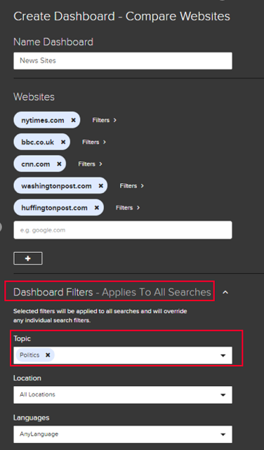
You can benchmark the engagement of web domains across multiple social networks over any one-year timeframe over the past four years. As an example, we’ll start off with five popular news sites: NY Times, BBC, CNN, Washington Post, and Huffington Post.
If you’re looking to dive deeper into these sites’ performance, you can add filters to surface topical or keyword-related content from each site, or “Dashboard Filters” that apply to all of the publishers in your search. For example, if we’re looking to analyze political content from these sites only, we’d select “Politics” in the Dashboard Filter section:
Once you’ve created your dashboard, navigate to the date selector on the top left of your screen, and select whether you’d like to benchmark content from the past week, months, or year.
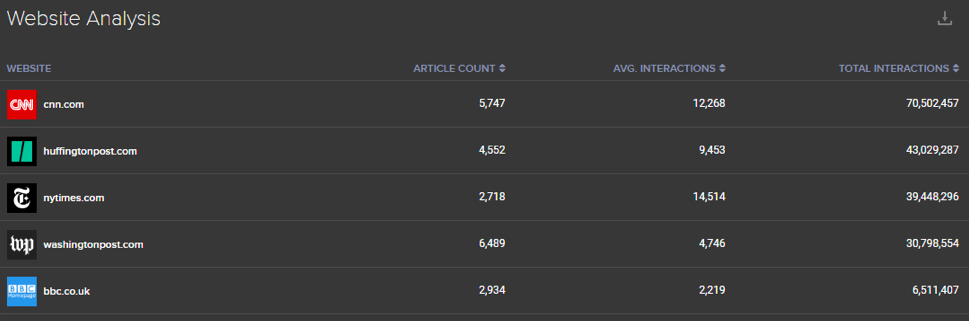
The first graph shows the overall performance of your selected domains. This graph shows the total performance of news sites form the past 6 months, in comparison to the amount of content they published and their average story performance. In this example, we can see that while CNN drove both the highest total interactions for their stories, the NYTimes actually had higher engagements per article.
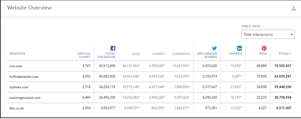
The Website Overview graph shows the more granular metrics that fueled overall site performance — with engagement rankings across Facebook, Twitter, LinkedIn, and Pinterest. You can filter to see which publishers dominated certain networks, and which performed best overall:
The Over Time Comparison graph shows you how engagement for every site has trended up or down for your selected time period. We can filter this chart by a variety of filters — to concentrate on specific social networks only, or to track average engagement over time rather than total engagement or output:
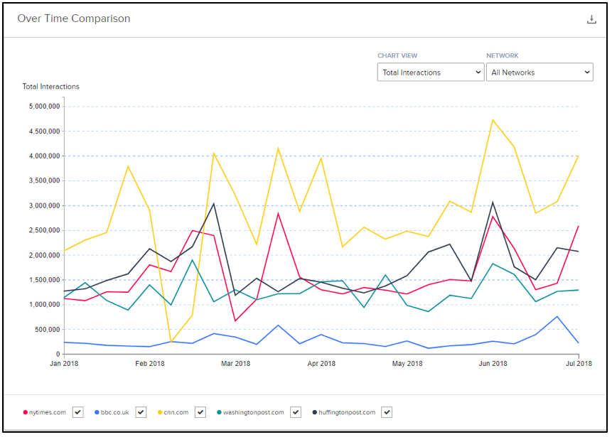
You can highlight any of the peaks or valleys in this Over Time Comparison to see which content was responsible for the trend. You can either click on a data point anywhere along each data series, or you can highlight a whole section by clicking and dragging your cursor:
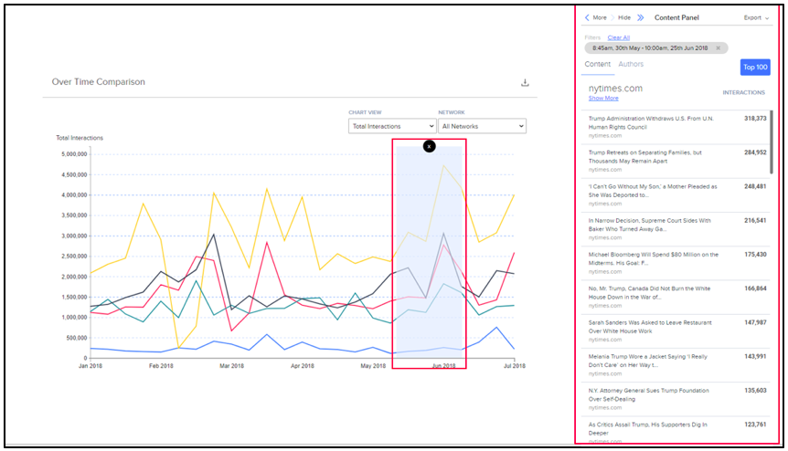
Once we’re ready to do a deeper dive into the content performance of each of these publishers, we can fully expand the content table and drill into top stories, referrals, and engagements by network. Here we can see the most engaged stories for each publisher over the past 6 months, and the top referrals that drove their performance:
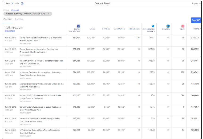
We can also switch to the Authors tab to see which writers performed best overall and drove the most engagements for their respective publications. Or, if you’d like to see what stories performed best overall for this set of publishers, you can click “Top 100” to see the top stories for the time period in order, rather than segmented by publisher.
Comments
Please sign in to leave a comment.